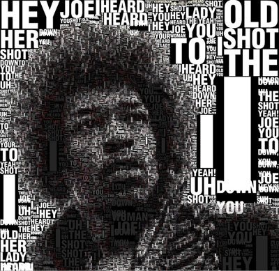
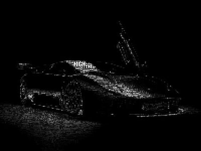
Some people think that type is just words and often just think of black and white text....but the truth is, type can be just as pleasing to the eye as a photograph. These are a couple examples I found floating around on the web...
As far as web typography goes, there are a few common mistakes that should be avoided.
Don't change font families or sizes randomly. The more fonts you have on your page, the more confusing it will be. Not to mention it will just look bad. Try to keep a consistent look on the page. Large fonts say that the information is important.
Just because you pick the perfect size font for your page doesn't mean it's going to be viewed in that size. Visitors can easily change the size of the font with their browser. So before you think that you've made the perfect font choice, maybe you should test it at a different size.
Not all browsers may display your font. Just because you love the way this one font looks doesn't mean it will be the best choice. If the person viewing the site doesn't have that font installed on their computer, they will not see the font you chose. Try to stick with common fonts so that the your site doesn't display in random fonts.
If you pay attention to these little details, you can make a good site, even better.


 RSS Feed